
Oceanographic Observations
We now transit from viewing weather systems from space to observing the oceans. Most of the oceanic information, however, comes from metsats, although several satellites, and a few Shuttle missions, collected oceanographic data. The kinds of data acquired by the sensors include the following: sea-surface temperature, oceanic-current patterns, formation of eddies and rings, upwelling, surface-wind action, wave motions, ocean color (in part indicative of phytoplankton concentrations), and sea ice status in the high latitudes. Coastal and shelf waters adjacent to continental margins generally show considerable variation in near-surface temperatures. Some of this variation is due to inflow and mixing of river waters but ocean currents and upwelling also modify the patterns. Look at the two thermal-IR images, made from NOAA AVHRR data, of part of the California coastline from Mendocino, south to Lompoc (top), and the big Island of Hawaii (bottom), in which offshore warmer waters are displayed in lighter tones.
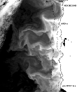
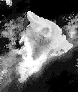
14-26: Comment on the thermal patterns in both of the above images. ANSWER
Ocean currents, such as the Gulf Stream off the eastern U.S. coast, and the Pacific current, off the west coast, result from redistribution of warm water that collects in tropical regions and flows towards cooler zones at higher latitudes. A color-coded rendition (below, top) of part of a Day-Thermal HCMM image (see Section 9) shows the well-defined Gulf Stream off the North Carolina-Virginia coast. Paired with this image is one of the East Coast showing surface temperatures calculated from algorithms that process multi-channel data obtained by NOAA-14Õs AVHRR.
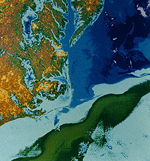
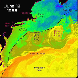
This second image also shows the Gulf Stream, which, in places, breaks into warm core rings, i.e., some meanders in the current get pinched off (cold core rings also occur). Temperature values for the colors include: orange = 25-28 ° C (77-82 ° F); yellow = 23 ° C (72 ° F); green = 14 ° C (57 ° F); blue = 5 ° C (41 ° F).
14-27: Birdwatchers today are taking a new kind of bird trip: the pelagic (off-shore ocean) boat trip to see many varieties of sea birds. Off the Virginia and North Carolina coasts, these trips often venture as much as 60 to 80 miles seaward from the coast. Can you guess as to why? ANSWER
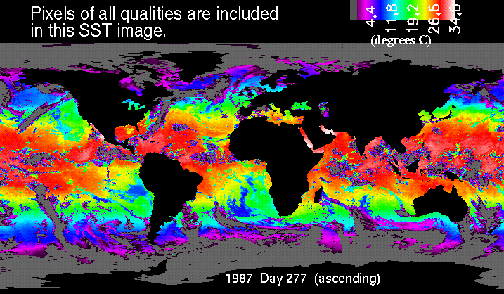
Daily, metsats also routinely procure global observations of temperatures in marine waters (known as Sea Surface Temperature or SST). Here for example is a map of SST made in late September of 1987.
We can integrate SST values into calendar intervals and thus compare them month by month or between equivalent periods in years. Below are SSTs for the months of January (top) and July (bottom) in 1993, as determined from NOAA AVHRR data.
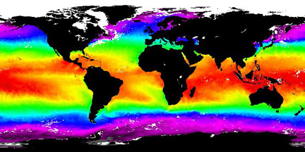
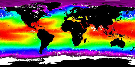
Again, reds and yellows show warm water, and blues and purples depict cold water. At first glance, we donÕt see much seasonal variation, when we view it worldwide, although close inspection reveals real differences. In general, the oceans tend to maintain their average temperatures with notably less variations than the atmosphere above them. El Ni–o
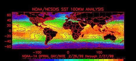
Sea surface temperature distribution on a worldwide basis can be obtained from NOAA satellite data on a near real time basis. Here is a plot for the date (Feb 26-27, 1999) in which the writer actually downloaded a completed plot of SST during the afternoon the the 27th.
El Niño
Satellite observations were instrumental in identifying and understanding the "El Ni–o" weather phenomenon. The term (Spanish for "the little child") refers to a weather pattern in the southern hemisphere around Christmastime. El Ni–o results from changes in atmospheric pressures in the eastern Pacific Ocean that cause the normally westward flowing trade winds to reverse direction, which, in turn, diminishes or reverses an upwelling of cold water off the South American coast and displaces the Peruvian current. The surface waters there become warmer (as much as 8° C [14° F]) leading to increased southern-hemisphere summer-storm activity. In North America, an El Ni–o can greatly perturb normal weather patterns, causing abnormal rainfall in some parts of the country and droughts elsewhere. Ferocious storms are more frequent and hurricanes may increase or decrease from normal numbers, depending on the effects in the Atlantic and Pacific Oceans. An El Ni–o usually precedes a La Ni–a, essentially a reversal of conditions off the western South-American coast, in which colder water than usual comes to the surface.
The overall El Ni–o condition was particularly active in the early 1980s, Experts in early 1997 predicted a very strong El Ni–o condition for the latter half of that year into 1998. It's disaster phase may have started in 1997, with Hurricane Pauline on October 9, the strongest to hit the west Mexican coast in decades (devastating Acapulco). Events into January 1998 bear out the forecast, with heavy rainfall in the Southern and Western U.S., ice storms in New England and Canada, and abnormally balmy weather in some places.
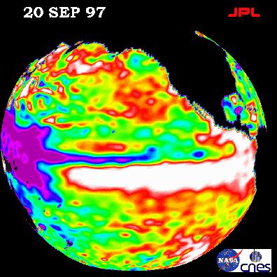
This onset of marine warming, in fact, began to appear in this Topex/Poseidon image, taken on September 20, 1997, which shows a broad, elongate band of very hot water stretching westward from Peru across the Pacific.
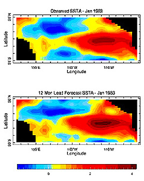
The next image pair shows the observed SST between Australia and South America during January of 1983 and a prediction of the expected temperature distribution based on twelve months of earlier observations. The close correspondence between these two El Ni–o data sets implies that, even then, the model explaining this phenomenon had become fine-tuned.
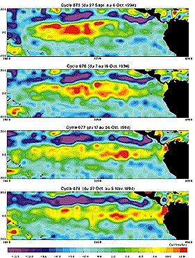
Below are four plots of SST from October into November of 1994, showing the progressive shift of warmer waters to the east.
Although regional in extent, this water-temperature perturbation can decidedly influence weather over much of the Earth, as the conditions in the western Pacific also become disturbed. The combination of warm Pacific Ocean temperatures and shifts in the atmospheric jet streams means that certain areas of the world with typically dry conditions, instead, get heavy rain and potential flooding, while other regions can be drought-stricken. An El Ni–o occurs every two to seven years, reversing normal weather patterns throughout areas of Canada, the United States, Mexico, South America and as far away as Africa. The last major El Ni–o occurred in late 1991 through mid-1992, with a smaller and less destructive one recorded in 1994-95. The weather system can last as long as eighteen months, depending on how rapidly the ocean temperatures cool and return to normal. We see that El Ni–os have a profound effect on global weather systems. We support this idea with the recent summary of 1997 worldwide temperatures: that year was the warmest twelve months in terms of average temperature maxima since records for the entire Earth started in 1860. Some of this may also reflect a significant contribution from global warming.
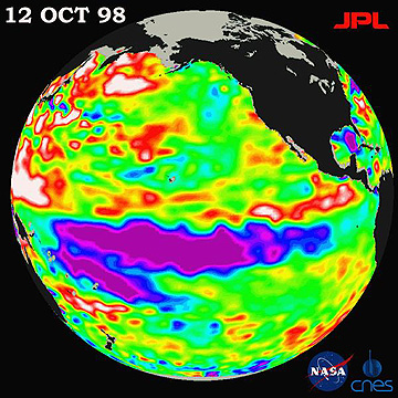
As the summer of 1998 moved into fall, with several major hurricanes including Mitch, which killed more than 10,000 people in Honduras and neighboring Central American countries, a transition began, in which the earlier El Ni–o gradually changed into a La Ni–a. By mid-October the central band of cold water had largely replaced the equatorial belt of warm water, setting up the conditions associated with a La Ni–a, as shown in the Topex/Poseidon illustration below. The purple band denotes cooled (contracted) water some 18 cm (7 in) below normal heights.
At present there is an excellent Web site sponsored by NOAA that offers an overview of El Ni–os and daily to monthly reports on their stage of development and related activities. You can access this site through the link NOAA-El Nino. You can access data on El Ni–o, as monitored by Topex-Poseidon (see next page), through a JPL site.
14-28: What can we do now to stop or control the Niña's? ANSWER

Primary Author: Nicholas M. Short, Sr. email: nmshort@epix.net
Collaborators: Code 935 NASA GSFC, GST, USAF Academy
Contributor Information
Last Updated: September '99
Webmaster: Bill Dickinson Jr.
Site Curator: Nannette Fekete
Please direct any comments to rstweb@gst.com.