
The Heat Capacity Mapping Mission (HCMM)
On April 26, 1978, NASA launched a sensor system capable of measuring temperatures and albedo, from which the apparent thermal inertia (ATI) of parcels of the Earth's land and sea surfaces can be estimated. This was the Heat Capacity Mapping Mission (HCMM). It used a two channel radiometer: one channel detected visible to near- IR radiation, 0.5 to 1.1 µm, and the second detected emitted thermal IR, 10.5-12.5 µm interval. Following a near-polar, Sun-synchronous, retrograde orbit, at a nominal altitude of 620 km (385 mi), the satellite passed south to north over acquisition targets in the early afternoon (about 2:00 P.M. at the equator) along pathways inclined at 7.86° to longitudinal lines. Night passes were also inclined at 7.86° , but in an opposing orientation relative to longitudinal lines, so the day and night paths were symmetrical. A night pass, descending north to south, covered its target between 1:30 and 2:30 A.M. local time. It imaged the same area about 12 hours later (one-half diurnal cycle in eight orbits) at latitudes from 0° to 20° and 35° to 78° . It imaged again 36 hours apart (one and a half cycles) between 20° and 35° latitude (of course, cloud cover compromised some images). The repeat cycle, covering approximately the same area in the day-night pattern, was 16 days. The altitude and sensor optics produced a swath width of 715 km (445 mi) and a spatial resolution of 500 m (1640 ft) for the visible channel and 600 m (1968 ft) for the thermal channel, whose sensitivity (ability to discriminate differences) was about 0.4° K at 280°K.
Because we acquired the day and night passes over the same areas along paths at opposing inclinations, and individual pixels scanned by the thermal sensor do not precisely cover the same ground areas (Instanteous Fields Of View), i.e., do not coincide, we must co-register equivalent ground plots using a computer program that uses specific control points (features recognizable at the 600 m resolution). Once we register the pixel sets , then we can calculate the temperature differences (D T) for a particular cycle from the values obtained at the mid-afternoon and middle of night times (note that D T will not be maximum since the coolest time is several hours later, around dawn). We can derive the apparent albedo 'a' (ranging from 0 to 1 [the maximum is equivalent to 100% reflection]) from the Day Visible channel values. These values are the sensor-obtained values needed to calculate ATI according to the formula: ATI = NC(1-a)/D T, where N is a scaling factor and C is a constant related to the solar flux (irradiance), generalized for a given latitude. Images made to show variations in ATI for a scene show high values (smallD Ts and/or low albedos) as light tones and low as dark tones. Day and Night temperature images follow the usual convention of light as warm and dark as cool. We must interpret these images cautiously, because many of the factors mentioned earlier in this section can affect the temperature state at any or all point(s) and usually we can't control them. ATI, then, is only an approximation.
9-16: Calculate the ATI for a material that attains a temperature of 30° C in the day and 15 °C at night. The apparent albedo is 0.3. For this case, at a latitude of 40° N and a date of June 21st (summer solstice), the constant C = 1.605. (Note: in some instances, the formula is further simplified by setting N = 1; this gives ATI values in the same general range as we observed earlier for P). ANSWER
We begin our look at HCMM images with this instructive full Day Visible scene
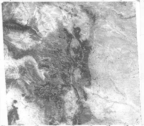
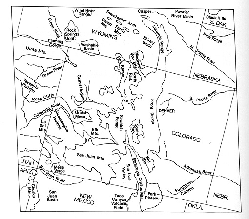
that extends for more than 640 km (398 mi) across and in so doing, completely encompasses the state of Colorado as well as parts of surrounding states, from the Great Plains in Kansas, west into Utah and north into Wyoming, as located in the accompanying map.
The Rocky Mountains stand out by their dark tones, caused mainly by coniferous vegetation, in sharp contrast to the lighter tones associated with the Plains and Basins. The lofty Rockies are somehow less impressive when flattened in this image.
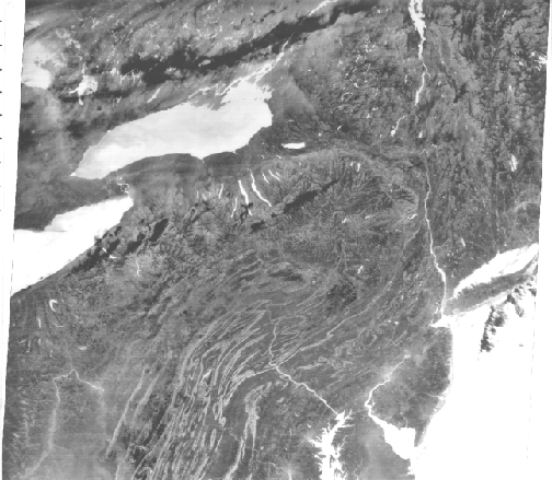
To gain a feel for the thermal images, let’s examine several HCMM scenes that capture part of the northeast U.S. and neighboring Canada. Look first at a 467 km (290 mi) wide section extracted from a full Day Visible-Near IR image obtained on September 26, 1978.
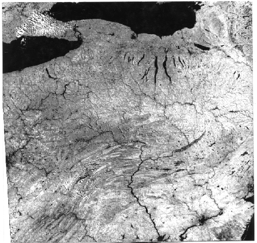
The largest scale features are Lakes Ontario and Erie. The Finger Lakes of New York are evident. The main rivers in the scene are the Susquehanna and Delaware Rivers, visible mainly in the lower right third of the image. Philadelphia and New York City appear as dark tones. Compare this image with the MSS Band 5 view of the same area shown in the Overview. The regional geology is dominated by the Coastal Plains and Piedmont (lower right), the fold belt of the Appalachians, the Appalachian Plateau, and glaciated upstate New York into Canada (upper left). In the right center is a narrow, curved dark pattern that we identify as the Wyoming Valley of eastern Pennsylvania (Wilkes-Barre/Scranton areas), a major anthracite coal belt. Note the few cumulus clouds.
The Day Thermal image taken at the same time presents distinct differences.
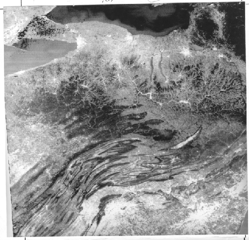
The thermal structure of the lakes is evident. Similar to the Thematic Mapper 6 image, Lake Erie is warmer than Lake Ontario. The white clouds west of Buffalo are depicted as very dark (cold) in the thermal image, consistent with their generally low temperatures as condensation in the atmosphere. Much of the land shows in medium grays. Very dark areas associate with the fold ridges and with sections of the Appalachian Plateau. These areas relate to heavy deciduous tree cover in these mountainous areas. The trees cool their surroundings by evapotranspiration. Five major metropolitan areas - Buffalo, Rochester, Syracuse, New York City/New Jersey, and Philadelphia/Wilmington - stand out as very light tones, indicating warmer temperatures. A few rural areas also are light (warm) for reasons not obvious. But the Wyoming Valley stands out from its surroundings by its very light tone, which is the result of higher radiant temperatures caused by the widespread dark shale, mixed with black coal dust (blackbody effect).
Next, we show a nearly cloud-free full image of nearly the same area, but extending into western
New England, across Long Island and down to the mid-Chesapeake Bay. We obtained this image in the night of November 2, 1978. Lakes, rivers, and the ocean appear much warmer than the cooler land. This is an apparent paradox: even though the water has cooled somewhat during the night, it normally experiences smallerD Ts than the land. During the day water is notably colder than the land, and in the night it appears warmer than the land, because of its heat retention and the commonly larger drop in land surface temperatures. This plot may clarify this idea.
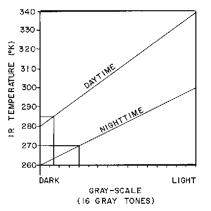
This plot shows the assignments of gray tones as a function of radiant temperatures for the Day and Night images. Here, a temperature of 285°K on the land has a darker gray level than a temperature of 270°K for that same surface in the night. If (case not shown in the plot), water during the day had a temperature of 280°K and dropped at night to 275°K, we can extrapolate these values to the two straight-line plots: the 280°K gray level would be very dark and the 275°K level would be lighter than the corresponding land value. This reasoning accounts for the relative land-water gray tones noted in the Day-IR and Night-IR images shown above.
In the night-IR image, cities are slightly warmer than their surroundings. The ridges in the folded Appalachians appear warmer, largely because they have dropped their leaves (thus, no longer cooling by evapotranspiration), and underlying rock units contribute to the thermal response. The Wyoming Valley is not emphasized by warm emission from the coal/dark soil surface and is only locatable from the ridge pattern enclosing it. Some valleys appear conspicuously dark, perhaps because of cold-air drainage from uplands. Dark cloud banks (cold) are evident north of Lake Ontario.
9-17: Bring back to memory your knowledge of the Harrisburg region you built up from taking the test at the end of Section 1. In the visible and thermal images shown on this page, locate features from the test scenes and note their tonal patterns in the thermal images. ANSWER
The first ever ATI image came from satellite observations of this eastern U.S. area (HCMM Day images on May 11 and a night image on June 11, 1978).
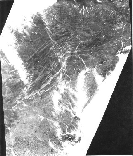
Water has a very bright tone, as do clouds (upper left) and snow (not in this image). The value of (1 - a) is near the maximum for water (with a moderateD T), hence a large ATI. But, for clouds and snow, having high albedos, thus tending to lower ATI, theD T is quite low, countering the (1 - a) effect by raising ATI (because of its position in the denominator). A typical ratio of (1 - a)/D T for water is 0.98/3 =? 32.7; for snow is 0.40/2 = ?20.0; and for moderately reflective soils is 0.70/20 = ?3.5. As a generalization, vegetation has moderate to low ATIs, as do many soils, while basalt has a very low and granite a moderate-to-high ATI. Heavily forested areas in the Appalachians are dark, denoting low ATIs. Those soils in the Piedmont and Coastal Plains, where they are exposed better because of fewer trees, have somewhat higher ATIs. We can crudely separate the Piedmont rom the Plains by its lighter tones.
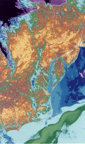
The same Day-thermal image, which we used as partial input in making the following ATI image, reveals a prominent thermal pattern in the Atlantic ocean, when we assign colors to the different calibrated temperatures.
9-18: Account for the black, purple, and blue colors on the continent. Where is the coldest part of the Atlantic Ocean in this scene? What is responsible for the green band in that ocean? ANSWER
Several shades of darker blue mark zones of colder water. Near the bottom, within a lighter blue body, is a greenish curving pattern that represents the somewhat warmer Gulf Stream moving northward enroute to the Outer Banks off Newfoundland.
JPL operated HCMM to prove, or get further insights into, applications in most of the same disciplines addressed by the Landsat program. Among the objectives successfully investigated were:
Consider this definitive example of a geological application of HCMM data, developed by Anne Kahle and her associates at the Jet Propulsion Laboratory.
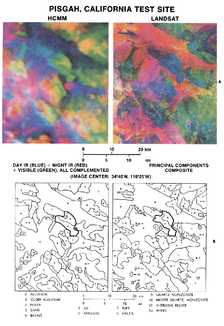
The area examined is in the eastern Mojave Desert of California, in which basin and range topography similar to the Death Valley region dominates the landscape. The color image in the upper right is a Principal Components Composite, using the four Landsat Multispectral Scanner bands. Correlation of color units with rock types and deposits mapped in the field is expressed in the map at the lower right. Of particular interest is the heavy lined feature near center, which encompasses a basaltic cinder cone and associated lava outpourings known as the Pisgah Crater. The corresponding scene (upper left) constructed as a composite of HCMM Day IR (blue), Night IR (red) and Day Visible (green) shows similarities and differences. Alluvium clearly shows in blue tones, and more silicic volcanics appear in red. The lava flow emanating from Pisgah Crater appears now to consist of two units, poorly separated in the PCA product: basalt with a pahoehoe-like (ropy) texture and basalt with a (cindery) texture.
Finally, we look at a fascinating special product,
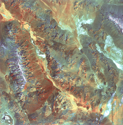
produced by Rupert Haydn of Bavaria, in which the Death Valley Landsat scene (here cropped to show only the northwestern 60%), comes from a TM 4 image (I), convolved with the TM 6 thermal image (H) and a HCMM Day IR image (S). The letters in parenthesis refer to a different method for making color composites known as the IHS system, where the three primary colors are assigned to derived intensity (I), hue (H), and saturation (S) parameters. Again, reds denote hot, blues cool, and yellows and greens intermediate temperatures. As with the Thermal IR Multispectral Scanner imagery, the alluvial fans show in reds, some salt deposits in blues and greens, and certain playa beds in yellow.
We would be remiss if we didn't bring to your attention a wide range of applications of thermal remote sensing that involve aerial flights and, now routinely, ground studies with infrared instruments that are portable - even hand-held - and easy to master with little training. Most of these uses involve operating the equipment at night. Probably the most dramatic display of this expanding technology was the graphic scenes during the Gulf War of 1990 in which CNN and other networks showed the Iraqi defense in Baghdad as a series of greenish-color live-action firings of anti-aircraft tracer flights and occasional hits by incoming missiles. This was a thermal IR display using TV cameras equipped with sensors that responded to the thermal variations of features, from buildings to weaponry, in the scene. Many other applications can be cited: in industry, process control, energy audits (heat expenditure and loss), machinery function; in law enforcement, police surveillance; in firefighting, search and rescue, wild fire reconnaissance, smoke penetration; in medicine, abnormal variations of body heat related to disease and malfunctions, in environment, wildlife observation and management, oil spill detection; and much more.
All of these tasks depend on detecting temperature differences in objects that vary in their thermal response. For example, hot spots in a building could indicate inefficient energy distribution including unwanted heat leaks. Tanks and soldiers on the move can be monitored at night. Felons breaking into a closed bank stand out as warm bodies moving about in a suspicious manner. An abnormally warm area around the human throat could mean a thyroid disorder.
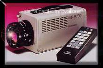
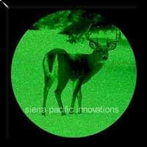
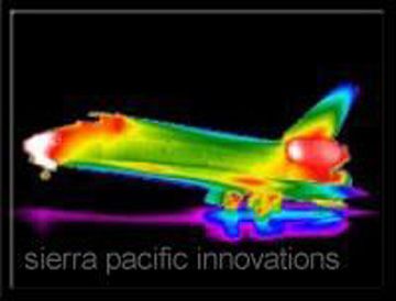
This now widely used technology, called Thermography depends on scanners and cameras with detectors sensitive to emitted thermal radiation. In the 3-5 µm region, Indium-Antimony (InSb) and Platinum silicide materials are sensitive to radiation in that spectral interval, with thermal photons knocking off electrons to create the varying signals that indicate temperature differences. In the 8-14 µm region, Mercury-Cadmium-Telluride detectors are used. Detectors that respond to quantum effect radiation require cooling. Others, that rely on what is known as the pyroelectric effect, can be uncooled; these include radiometers and ferroelectric bolometers. Depending on what is done with the signals, the imaging systems can be shown visually in black and white, in green tones, or in color (by assigning different colors to different temperatures). The sensors can detect over wide temperature ranges (e.g., from - 20 to +1100°C) while being able to measure temperature differences as small as 0.5 to 1.0 degree. We show examples of two instruments. First, is a hand camera marketed by Sierra Pacific Innovations (check their interesting Home Page) called the IRM 700.
This camera , which has a Platinum silicide detector sensing radiation between 1.2 and 5.9 µm, produces high resolution images, like the one below, to a kilometer or more range.

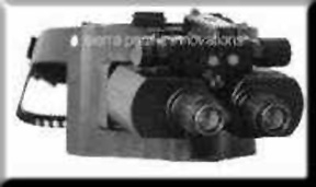
The second is even more exotic. Here is a set of Night Goggles which can be worn by a person directly over the eyes. It has proved invaluable to police raiding a building, firefighters, and hunters, as well as military personnel in combat.
9-19: Think of several (imaginative) ways in which you could use Night Goggles. ANSWER
This next image shows the view through a telescopic sight adapted to thermal infrared detection of a deer (whether this is a hunter's target or the subject of a naturalist's study is not known).
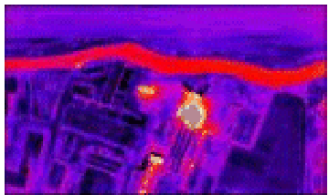
We can learn more about these diverse uses of thermography - especially the Night Vision mode - just by looking at some representative images. Let us turn first to energy budget assessments, in which both aerial and ground thermal scenes look for abnormalities in heat distribution. Start with this aerial scanner night view of a residential area.
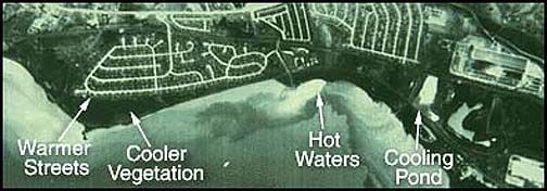
The warmer areas are the river, particularly a light-toned plume that results from industrial fluids being dumped and a cooling pond that receives water from a nearby plant (warm signature). In the residential section, houses are cool but the streets display higher temperatures since they are asphalt covered (this black tar material absorbs solar energy during the day and re-radiates thermal energy at night).
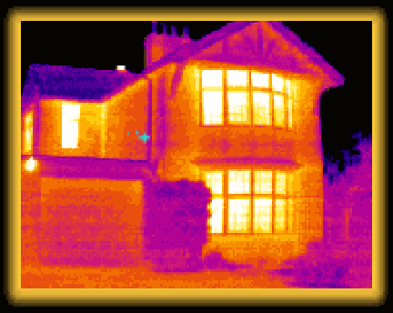
The next scene is a colorized depiction of temperature variations in a series of homes and other buildings. The reds and white denote "hot spots" - either from small workshops or from individual houses in which excessive heat is being lost.
Heat variations abound in individual houses, as shown here:
At the street level, this night scene shows people, an auto, and houses in terms of relative hotness:

9-20: Note the house on the left, and particularly its roof. There are two bright pattern "hot spots" on or near the roof. What might they be? Account for the hot areas on the auto in the right part of the scene. ANSWER
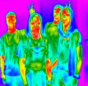
Individuals in everyday clothing appear as distinct temperature variants. Their faces usually are warmer (reds) than their outside clothes (in cooler greens and blues):
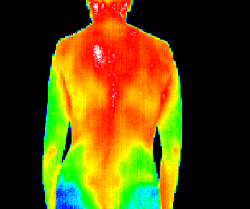
The human body, unclothed, reveals surprising differences in temperature, much being normal but occasionally with areas whose thermal departure from the norm may have significant health implications. In this case, the small white area on the back is indicative of a potential problem.
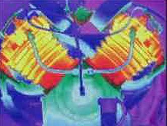
Individual inanimate objects experience temperature differences as they operate. Two examples will suffice. First, peruse this thermogram (another word for thermal image) of a motor doing its thing.
And, consider the heat distribution within this pipe fitting:
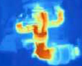
Returning to a space theme, here is a thermal snapshot of the Space Shuttle as it landed at Cape Canaveral.
9-21: Explain the two larger areas of warmer temperatures on the Shuttle. ANSWER
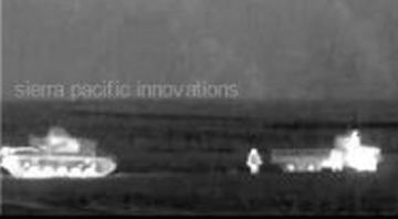
Finally, let's take a quick peek at one aspect of military use - here the appearance of a tank and a supply truck operating actively during maneuvers.
We can safely conclude from this review that thermal imagery opens new vistas in seeing the Earth's surface in a way largely unfamiliar to our experience. Thermal sensing is a versatile way to detect and identify features, using properties we seldom sense directly - certainly not with our eyes. There are two other kinds of thermal images not considered in this section: views of people and action imaged by "night vision" methods (a variant was amazingly presented as targets in Iraq during the 1991 Gulf War); and views of heat concentrating or escaping around a home being surveyed by thermal scanners for heat leaks. Hot stuff, eh!

Collaborators: Code 935 NASA GSFC, GST, USAF Academy
Contributor Information
Last Updated: September '99
Webmaster: Bill Dickinson Jr.
Site Curator: Nannette Fekete
Please direct any comments to rstweb@gst.com.